

Lab 4: Miscellaneous Image Functions
- Krista Emery

- Jan 7, 2019
- 4 min read
Updated: Apr 28, 2023
Background
This lab was designed to familiarize students with much of what Erdas Imagine software can do with satellite data. Students should be able to complete all the following goals according to the lab exercise steps.
Goals
Delineate a focused study area from a larger satellite image
Mosaic multiple images in an area of interest
Enhance images with radiometric techniques
Show how visual interpretation can be done through the spatial resolution
Connect Erdas and Google Earth applications for interpretation
Generate a graphical model for analysis
Experiment with different resampling techniques
Methods
Part 1
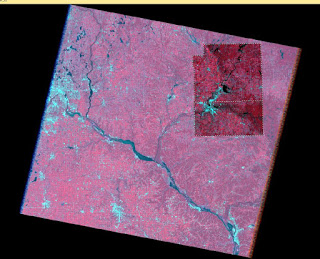
Subsetting portions of a study area is important in narrowing down the amount of image shown to only the area of interest (AOI). It is done using one of two methods: (1) creation of smaller scene with rectangular box using the Inquire box (Figure 1) or (2) delineating the AOI using headsup digitization or shapefile of the area. (Figure 2) The second method is more commonly used due to the first method’s requirement of a rectangular study area – rare in most study areas.
Section 1: Subsetting with the use of an Inquire Box
(See figure 1)
Section 2: Subsetting with the use of an Area of Interest Shape File
(See figure 2)
Part 2
Image Fusion is used to create a high spatial resolution image from a poorer quality image to enhance the visual interpretation of the spatial resolution in the outputted image. The input reflective image is different from the pansharpened image based on color and contrast. The pansharpened image I created has more saturated color and more contrasting colors than the brighter original reflective image. The reflective image shows the river and water bodies as a deep blue and the multispectral image shows the same features but dark black. The trees are easier to see in the multispectral image. The texture of the trees in the deeper red color are easier to see when the contrast is as high as it is in the newer image. There is evidence of a stair-step effect on linear features.
Part 3
Simple Radiometric Enhancement Techniques are used to boost image spectral and radiometric values. The input reflective image is different from the haze reduction image in several incidences. The haze reduction image has a green background compared to the reflective image’s black backdrop. The haze reduction image also has a more significantly more vivid colors than the original reflective image. The pinks in the reflective are now bright red in the haze reduced image. Differences in surface features become clearer in the haze reduced image. Like the pansharpened multispectral image in the last part of the assignment, the reflective image has a deep blue water color, and the haze reduced image has a black color for its water bodies. The input image has a slight stair-step effect present.
Part 4
You can use Google Earth as an interpolation key by linking and syncing Erdas and Google Earth. Google Earth contains valuable spatial data that can be used to interpret land use and specifics within areas of interest. Erdas allows the interactions on GE to be synced with panning and zooming.
Part 5
Resampling is used to resample up (reduce) or resample down (increase) the size of pixels based on project requirements. The appearance of the original image and the resampled image using the nearest neighbor resampling method seem the same. The resampling using nearest neighbor should result in an image that closely resembles the original image based on averaging the pixel values. The result of resampling using bilinear interpolation ended up smoothing the pixels to smaller sizes where the features appear much clearer and less pixelated than the original image.
Part 6
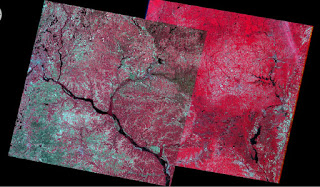
Image mosaicking is used to stitch two or more smaller portions of a larger study area together for a seamless combination tile. Two tools were used in this lab: (1) Mosaic Express (Figure 3) and (2) MosaicPro (Figure 4). MosaicPro is a more advanced version of Mosaic Express where the user can change various inputs to get different results than the simpler Mosiac Express.
Section 1: Image Mosaic with the use of Mosaic Express
The color of the output image is far more saturated and vivid than the original image. The color transition between one image to the other is quite distinct though. The right image is significantly brighter in terms of value than the left and a line can be easily seen between the two.
(See figure 3)
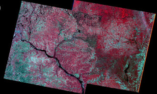
Section 2: Image Mosaic with the use of MosaicPro
Section 2 has the user mosaic two images from section one with MosaicPro, a more advanced stitching routine.
(See figure 4)
The mosaic pro took the histogram color corrections into account unlike the mosaic express, the pro imagery doesn’t show the boundary of the overlap as distinctly as the express does. The contrast between the two mosaicked images as processed by the pro tool is minimized.
Part 7
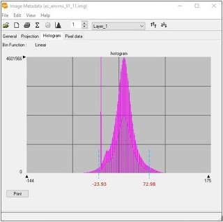
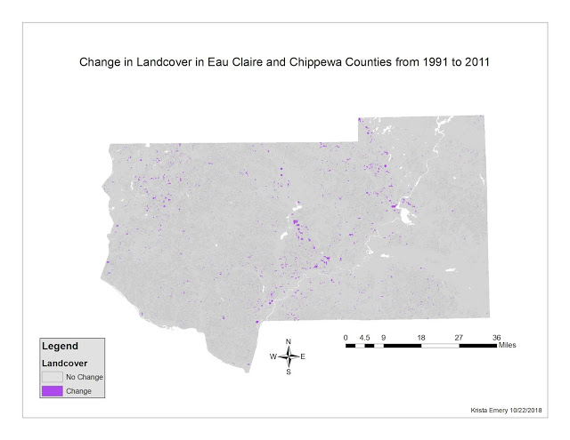
Binary Change Detection (image differencing) allows the estimation and mapping of brightness values taken from the changed pixels between two temporally diverse images. We used the equation in Section 2 to calculate the difference from the first image to the second.
Section 1: Creating a Difference Image
Figure 5 shows the original histogram, and figure 6 with marks that show the change portions from non-change areas.
(See figures 5 and 6)
Section 2: Mapping Change Pixels in Difference Images Using Spatial Modeler
We used the function: ΔBVijk = BVijk(1) - BVijk(2) + c to find the difference in pixels between the first and second image over time.
Where:
ΔBVijk = Change pixel values.
ΔBVijk(1) = Brightness values of 2011 image.
BVijk(2) = Brightness values of 1991 image.
c = constant: (127 in this case.)
i = line number
j = column number
k = a single band of Landsat TM.
(See figure 7)
Results
The areas of change over the 20- year period contain mostly cropland or were agriculturally altered over time. (Figure 7) The change in urban areas is a lot less evident compared to the areas highlighted out in ‘the middle of nowhere’. My interpretation of this is that the scale of which change occurs in rural areas a lot more consolidated and covers larger swaths of land than for instance, a new small housing development in town or small park.


Sources
Satellite images are from Earth Resources Observation and Science Center, United States Geological Survey. Shapefile is from Mastering ArcGIS 6th edition Dataset by Maribeth Price, McGraw Hill. 2014.


Comments